Friday, September 2, 2016

Thursday, September 1, 2016
Junior/ Senior Class Page Critiques
Typed in "Blogger" and this popped up
http://nypost.com/2016/08/31/mommy-blogger-who-poisoned-son-says-shes-being-bullied-by-other-inmates/
CAUTION. CONSTRUCTION ZONE AHEAD
Anyway. Heres my Index page link: http://eravensonline.net/students/440bms18/
http://nypost.com/2016/08/31/mommy-blogger-who-poisoned-son-says-shes-being-bullied-by-other-inmates/
CAUTION. CONSTRUCTION ZONE AHEAD
Anyway. Heres my Index page link: http://eravensonline.net/students/440bms18/
Tuesday, August 23, 2016
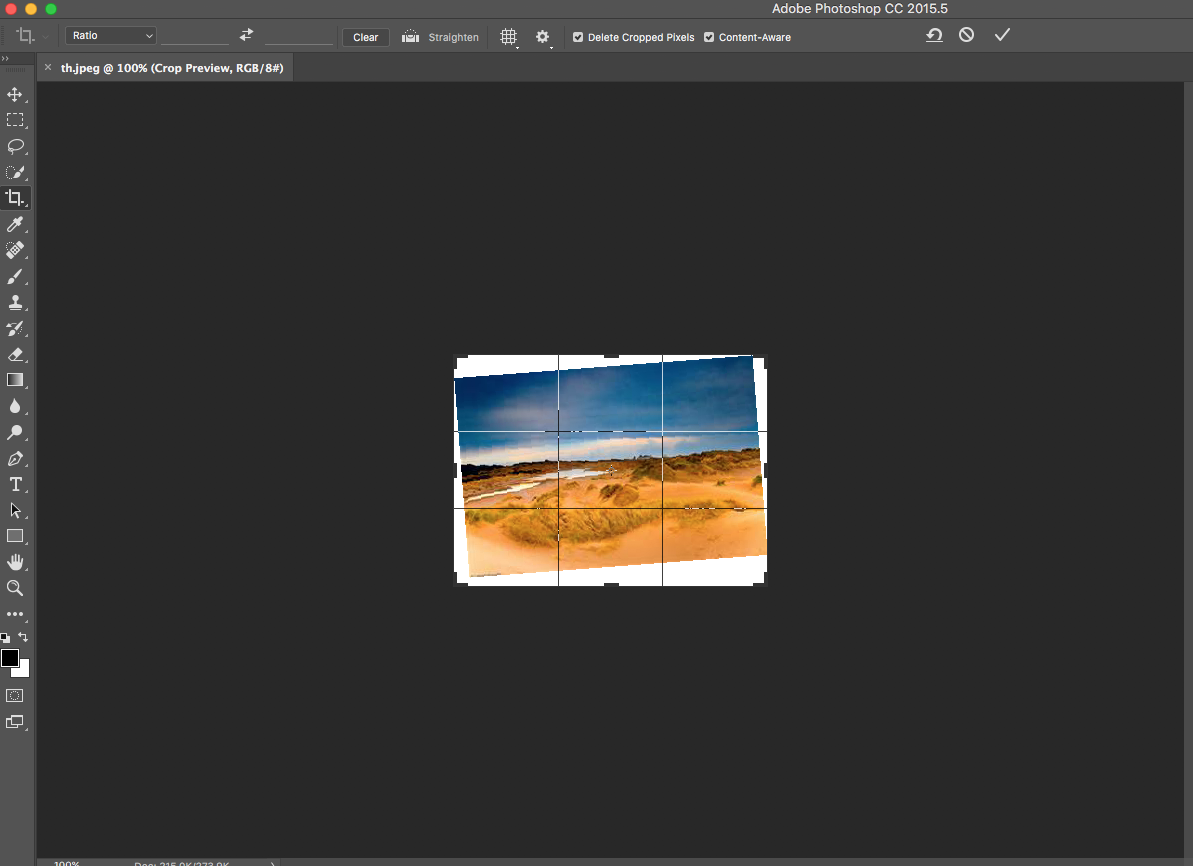
Content Aware Crop



Wednesday, March 9, 2016
Responsive Tips and Designs
Keep Logo Positions Consistant -


Remove Excessive Visuals for Smaller Screens -
Monday, January 25, 2016
6 Design Aspects

One way I feel that I can make my sites better is to refine the menus and make those smoother. ESPN (great website by the way) has a great example of a working


Thursday, January 14, 2016
My Personal Logo
The first half of my high school career is over and it was time for a rebrand. My personal logo from before was now obsolete and needed to be updated.
logo and puts more of a brand onto it. The other option was to bring out the tie and really focus on the coloring and patterns. Overall, I decided to make it a little modification to the design and try to make it as simples possible.
After working tirelessly on Adobe Illustrator and watching Republicans debate it out i finally churned out this bad boy;
 |
| Original Sketches |
The first part of this rebrand is to create sketches on various ideas for a logo. This "Personal Logo" is supposed to reflect you and your interests. I figured that even though baseball is my life, I should probably move on to something else, something that is a little more unique. Here I thought about how I like to throw on a nice shirt and tie every once and a while and expanded on the thought of having a tie as the centerpiece of the logo.
After putting in much thought, I narrowed it down to the three ideas which came down to whether or not I should put my name in on the logo or leave it out. The benefit of having my name on the logo is that it makes it more personal and adds to the personalization of the
 |
| Final Product |
After working tirelessly on Adobe Illustrator and watching Republicans debate it out i finally churned out this bad boy;
I elimenated as many colors and shapes as I could to make it simple and sleek
Thursday, November 19, 2015
Colorization Project

In this project, we took an old, rusty looking picture and touched it up with more color. Plop an image into photoshop and open up the hue panel from the bottom tab. Set the saturation to -70 and the rest to 0. Select the paintbrush and set it to 48px and 100% hardness. Paint stripes on the picture to your liking.
Subscribe to:
Posts (Atom)