Wednesday, May 17, 2017

Senior Final Blog Post

My Years Here

"Baseball, How I met your Mother, Some Web, Cheeto, and food." - Caitlyn Cottrill, on my 4 years in eComm.

Man it's been a wild ride.  Coming into the program, I was going to do animation.  Somewhere along the lines I was convinced to do Web and I couldn't be happier.  I can apply what i learned to life more than animation.  Its been fun.

Tuesday, May 16, 2017

Senior Project Blog Post

Senior Project

My project was to maintain and write a sports blog, Stepek Sports Blog to be specific.  I was hoping to get 1 or 2 posts out a week and I believe I have about 4 or 5 completely finished ones.  The first few are about the March Madness tournament and after that it's all baseball.


Process

The process is basically this;
                    1) Pick a topic to write about, say like my Oakland A's monthly report
                    2) Watch the appropriate game or games and gather stats and comments
                    3) Write the blog by mashing together the stats and comments

Conclusion

I learned that the hardest thing about writing a blog is coming up with something to blog about.  That was my biggest problem this semester.  I love baseball and I love talking about it but narrowing down my thoughts to find something to write about was tough.  I would start off each day watching a game with a team I kind of had an idea with and it would just drop out and I would lose it.

Link: https://tallguystepek.wixsite.com/stepek-sports-blog

Friday, May 5, 2017

Week of 5/1/17 - 5/5/17 Senior Project Blog

This week I've been working on my end of the month A's report, which is taking longer than usual.  While writing it, I've been watching a lot of baseball which makes it look like I'm not doing anything but I am.  I really want to start writing series previews for the A's and try to let my readers in on my opinions and thoughts and predictions on each series.  It'll be a lot of work and I don't have much time left unfortunately but it's worth a shot.

Friday, April 28, 2017

Week of 4/23/17 - 4/26/17 Senior Project Blog

This week I really didn't work on a blog.  I am planning to write a post on the Oakland Athletics and their month of April and my opinions on that.  To prepare for this, i've been watching a lot of baseball.  Shocker, right?  While I have been keeping a eye on the A's, in class I have been working on my new index site and updating that for the senior show.  I added a picture of my, taken by Allyson, and I added images to my links.  I rewrote my little blurb about myself too.

Friday, March 24, 2017

Week of 3/20/17 - 3/24/17 Senior Project Blog

So this week I continued to tweak my blog's design including the colors, layout, and small changes to the code to do things that I couldn't do in the editor.  I also took time to look up some tips about how to write good sports blogs.  I wrote about the Sweet 16 and i had my predictions out.  Not very accurate

Friday, March 10, 2017

Week of 3/3/17 - 3/10/17 Senior Project Blog

"My name is Brendan Stepek and I love sports more then anything in the world. So I am starting a gosh dang blog about it. It is going to be so freaking interesting that you will wait on the edge of your seat for me to post another post about all these wonderful teams that I love to watch. Oh and by the way the Royals are my favorite team on the whole entire earth, they are so so so much better then the Athletics, like there is no comparison. Anyway I am going to be telling you all about these games and all that stuff, and I hope you like it. bye."

- Allyson Chitwood, 2017

Tuesday, December 20, 2016

Semester 1 Final Blog Post


          Semester 1 was an interesting semester for sure.  I was gone a lot more than I planned on being gone and that really put me back on a lot of the projects as opposed to the focusing problems I've had in the past.

          The first real project was the MCML branding project.  With the random animal, numbers, letters, and element I was given I created a fictional baseball team called the Mercury City Mountain Lions (as seen in the first and last picture).  I was in Seattle for the back end of the project so I didn't get the actual website finished but the stats, logos, uniforms, and banner images are all completed.  I plan to finish it one day.  Fingers crossed.  For the uniforms I created a white home uni, an away grey, and three alternates; one red, one black, and one blue (as seen above).  I liked this project because it really gave me the freedom to pull baseball into this.

         I also got a divorce.

Wednesday, October 12, 2016

Step Mom's College Talk

How Much Does it Cost?
$16,000ish a year before scholarships

Who keeps the dorm rooms in check and makes sure they don't get out of hand?
"The R.A and but he's really chill..."

Do you think I should go there?
Yes, you should.

What is your favourite color?
"Wine Purple"

Monday, September 12, 2016

Steal Like an Artist Review

"Steal like an Artist" is basically guy who had an "ah ha" moment and put it into a semi-formal book sold for $41.99 (on Amazon, plus shipping).   It had some good points but it was really sloppy in presentation.  The author says that not all ideas are original and that you steal your ideas from many other places.  I guess this has some truth to it because, like our personality, we get everything from our surrounding.  With that being said, the notion that you have to take ideas from people to be successful completely negates the thought of original ideas.

Friday, September 2, 2016

Project Proposal

SO.  I got the letters J and W, the number 952, the mineral mercury, and a cat.

Tuesday, August 23, 2016

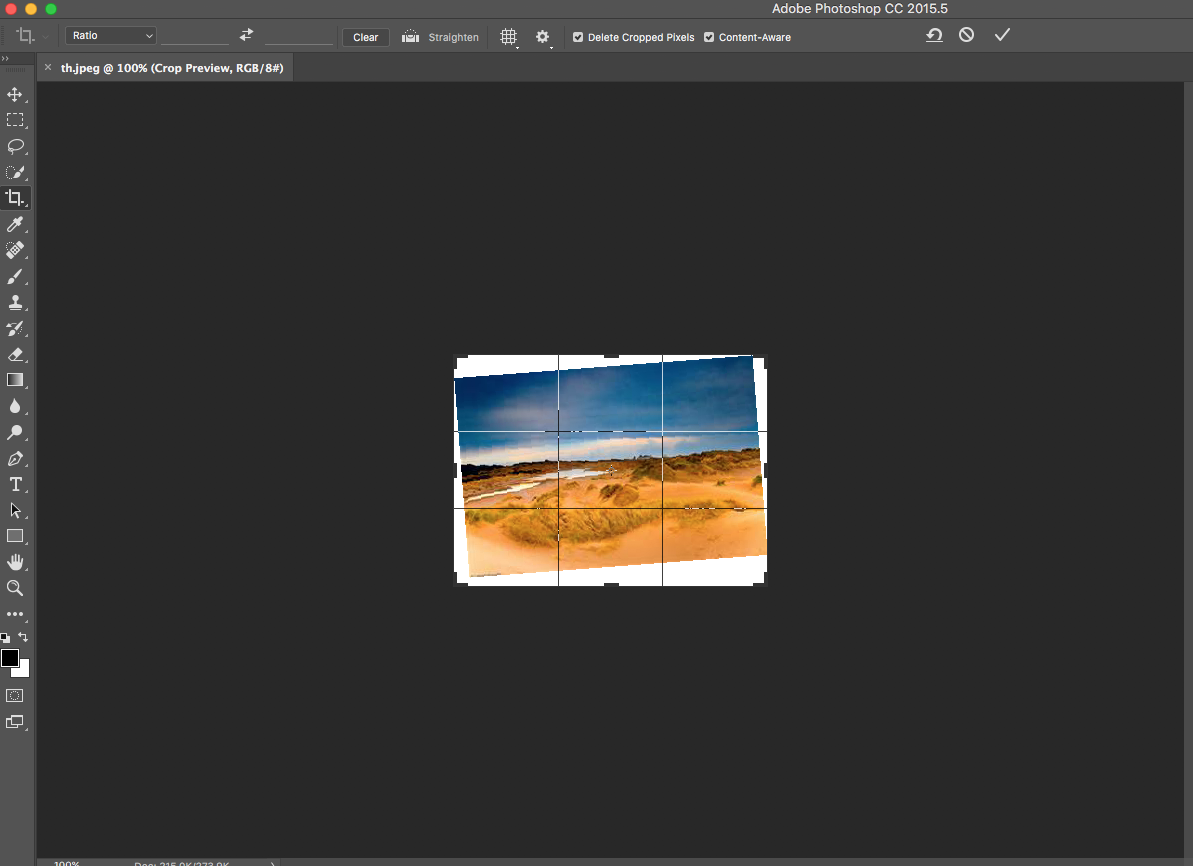
Content Aware Crop


OK.  Content Aware Cool is a pretty cool deal.   YOU MEAN THERE'S MORE CONTENT AWARE TO PLAY WITH?  Yes.  Yes there is.


Wednesday, March 9, 2016

Responsive Tips and Designs

Keep Logo Positions Consistant - 


Remove Excessive Visuals for Smaller Screens -

Monday, January 25, 2016

6 Design Aspects

 A reoccurring theme for my websites it that there isn't really a lot to set them apart from the sophomores and that simply isn't acceptable.


One way I feel that I can make my sites better is to refine the menus and make those smoother.  ESPN (great website by the way) has a great example of a working


Thursday, January 14, 2016

My Personal Logo

      The first half of my high school career is over and it was time for a rebrand.  My personal logo from before was now obsolete and needed to be updated.
Original Sketches

      The first part of this rebrand is to create sketches on various ideas for a logo.  This "Personal Logo" is supposed to reflect you and your interests.  I figured that even though baseball is my life, I should probably move on to something else, something that is a little more unique.  Here I thought about how I like to throw on a nice shirt and tie every once and a while and expanded on the thought of having a tie as the centerpiece of the logo.

      After putting in much thought, I narrowed it down to the three ideas which came down to whether or not I should put my name in on the logo or leave it out.  The benefit of having my name on the logo is that it makes it more personal and adds to the personalization of the 
Final Product
logo and puts more of a brand onto it.  The other option was to bring out the tie and really focus on the coloring and patterns.  Overall, I decided to make it a little modification to the design and try to make it as simples possible.

      After working tirelessly on Adobe Illustrator and watching Republicans debate it out i finally churned out this bad boy;
I elimenated as many colors and shapes as I could to make it simple and sleek


Thursday, November 19, 2015

Colorization Project


In this project, we took an old, rusty looking picture and touched it up with more color.  Plop an image into photoshop and open up the hue panel from the bottom tab.  Set the saturation to -70 and the rest to 0.  Select the paintbrush and set it to 48px and 100% hardness.  Paint stripes on the picture to your liking.

Tuesday, October 27, 2015

Jabberwocky Website

Final Result
Keep in mind that I suffer from colorblindness.
I also don't have any graphic design knowledge.

This project was where we had a preset html page and we had to edit the CSS to transform the website into a masterful work of art.  I obviously didn't get the memo that these we supposed to be beautiful.

Thursday, October 8, 2015

Don't Make Me Think Blog Post #1

Website with Excessive Background Noise

CNN.com - Although the site is well organized the adds in the background create unneeded noise that distract the viewer and can be somewhat annoying.

Website with low Competing Noise

Youtube.com - Youtube's sole purpose is to allow people to view videos posted by other people and it achieves that.  The simplicity of the website works to its advantage because it is easy to navigate and with the simple color pallet it works well.

Website where there is not obvious clickable areas


Website where it is obvious where to click

Wikipedia.com - Really not a big debacle about this one, the good ole blue link buttons are evident enough of what is clickable or not which is genius if you think about it.

Website not split up into clearly defined areas

MLB.com - The website is simple and it gets right to the point but when you scroll down all of the parts have the same background color and they all blend together at first glance.  Only when you look around you notice they're meant to be separate sections.

Website clearly split up into defined areas

ESPN.com - Unlike MLB.com, ESPN is physically split up into different sections where the viewer can clearly see where the section begins and ends.  It is very streamlined and organized and well put together.

Website that uses good conventions


Website that makes good use of visual hierarchies 

Apple.com - What Apple does good with their website is that they make it very simple with a white background and sans serif fonts and a sort of grey style color scheme.  When there is a big announcement they need to make they just upload a huge picture with a loud background and that will capture the attention of of the viewer right away.

Friday, September 11, 2015

Let Me Educate You on: Wordpress

     Wordpress is a database based website creator and produce.  They will help you create a website for free and host it in their database for free.  If you're looking for an easy way to make and maintain a website, Wordpress is for you.


WordPress.com 

There are two sites that you can use to create a website.  The first one is Wordpress.com.  This is if you want to create a site in the Wordpress database hosted by Wordpress.com

If you want to download the application and host the database on your own computer you go to this site and download it for free.  This allows you more hosting freedom and the ability to host bigger sites.

Friday, August 14, 2015

The Best Sites for Stock Images

     Images are a big component for creating a solid website.  Pictures make the website more interesting which draws more attention to the website.  Getting these pictures can be somewhat challenging due to copyright laws and trademarks.  Stock images are free images that anyone can use.  In this post I will go over four sites that offer stock images on Africa.  This is what I found for each website I used.

Gratisography

Pexels

Unsplash

Morgefile


     All of the pictures came out to be nice and crisp from all of the websites.  My favourite picture came from Unsplash.  The lion looks really cool in the tree and the branches are at the 1/3rd mark on each side.  I found the most photos on morgefile.  There were pages upon pages of photos you can choose from and there were a wide selection of topics.  There wasn't a standout website that was the best to navigate, all of them were fairly simple to find what you needed.

Gratisography
Pro: Photos that can be used for a lot of different sites
Con: You can't search for pictures and there are not that many.

Pexels
Pro:
Con:

Unsplash
Pro:
Con:

Morgefile
Pro:
Con: